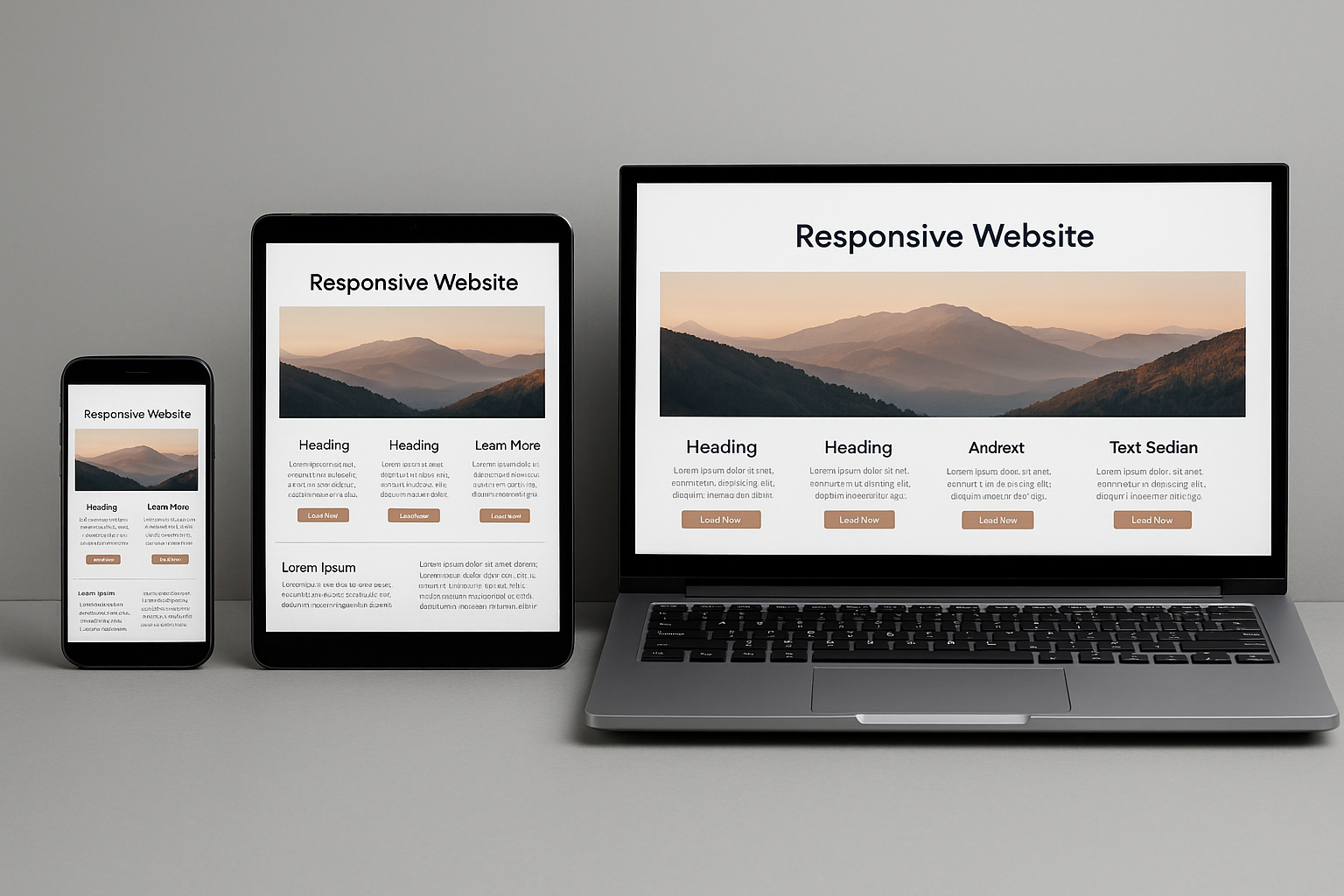
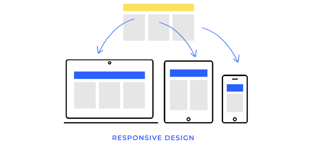
Responsive website design is no longer optional. It’s the baseline expectation for websites that need to work across phones, tablets, laptops, desktops, and whatever screen size comes next. The goal is simple, to make the content easy to read, navigate, and use – without pinching, zooming, or horizontal scrolling.
That matters because mobile use is substantial and persistent. Different data sources vary month to month, but global reporting shows mobile phones account for close to 60% of the world’s web traffic, and analytics datasets regularly show mobile at more than half of worldwide usage.
Need help making your site truly responsive?
Get a responsive audit and a prioritised fix list from our specialist team.
In this guide, we’ll explain what responsive website design and web development are, the core techniques to implement both, how to test properly (using current tools), and when it makes sense to work with a responsive web design agency like us – Seek Marketing Partners.
What is Responsive Website Design?
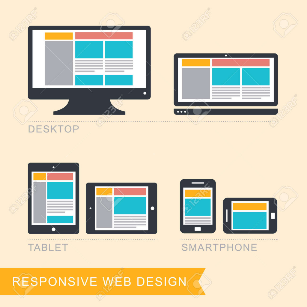
Responsive website design is an approach to building pages that automatically adapt their layout and presentation to different screen sizes and contexts, especially when created using modern Website Builder Software. In practical terms, that means content can reflow into one column on small screens, expand into two columns on medium screens, and use three or more columns on larger displays – without requiring separate mobile URLs or separate websites.
The concept was originally defined by Ethan Marcotte (in an article published by A List Apart). His idea brought together flexible grids, flexible images, and media queries into one clear approach for designing around the natural flexibility of the web.
What is Responsive Web Development?
If responsive design is the plan – the layout choices, component behaviour, and content priorities – responsive web development is the build. It is the engineering work that makes those decisions real in code and keeps them robust over time.
Responsive web development typically includes:
- Implementing fluid layouts and component rules so the design actually adapts.
- Setting up responsive media handling so that images and video do not break layouts or slow pages.
- Adding media queries (and, increasingly, container queries) to change styles based on layout needs
- Verifying accessibility requirements like reflow and touch target sizing
- Performance testing and iteration – because responsive that is done poorly can still be slow or frustrating on mobile networks.
This is why the best outcomes happen when design and development work together, not in silos.
Why Responsive Design is Recommended for SEO and Maintainability
Responsive design usually means one URL and one set of content that can be displayed differently depending on screen size. That approach is explicitly recommended as the easiest design pattern to implement and maintain, and it helps avoid the complexity of dynamic serving or separate mobile URLs.
It’s also important to note that some older “mobile testing” workflows have changed. Google retired the Mobile-Friendly Test tool and the Search Console Mobile Usability report on December 1, 2023 – while still emphasising that mobile usability remains critical and part of page experience guidance.
The Core Building Blocks of Responsive Website Design
Most web designers and developers agree on the fundamentals: viewport configuration, flexible layouts, responsive images, and media queries. The real difference between an “okay” site and a great one often comes down to how thoughtfully you apply these fundamentals to your actual content and components.
1. Set up the viewport correctly
A responsive site usually includes a viewport meta tag so mobile browsers size the viewport to the device width and don’t render at desktop widths and shrink everything down.

It matters because without it, mobile devices typically render pages at desktop widths and scale down, which makes text harder to read and touch targets harder to use.
2. Use flexible layouts instead of fixed widths
Responsive layouts avoid locking key elements to pixel-perfect widths that can break on smaller screens. A common pattern is to use relative units such as percentages, rem, or vw, and let content respond to available space, rather than forcing fixed dimensions.
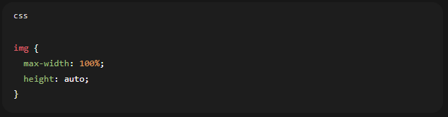
A practical baseline for images, even before advanced responsive image techniques, is:
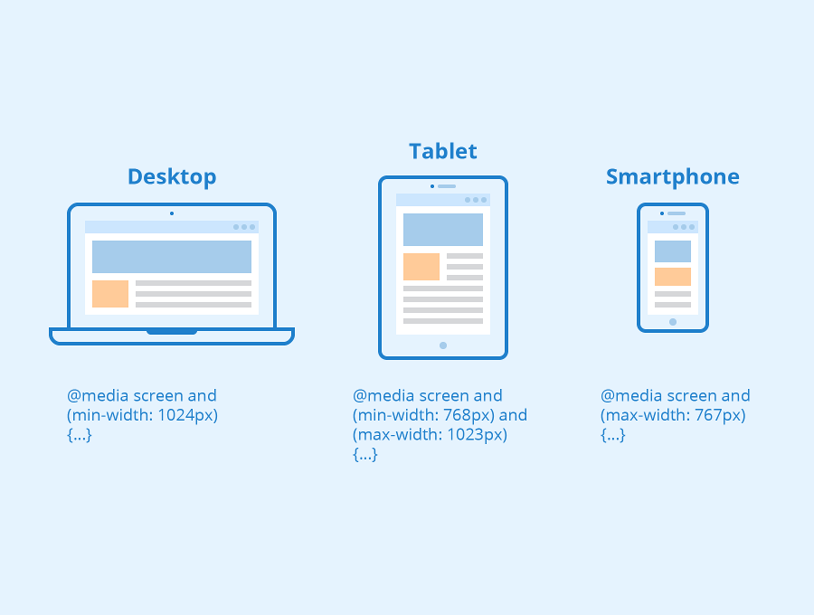
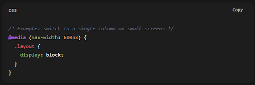
3. Use media queries for layout changes
Media queries let you apply different CSS rules depending on device characteristics. Most often, that means viewport width, but it can also include things like orientation or user preferences.
Modern media query syntax is actively standardised in Media Queries Level 4, which defines how authors test for device features and apply conditional styling.
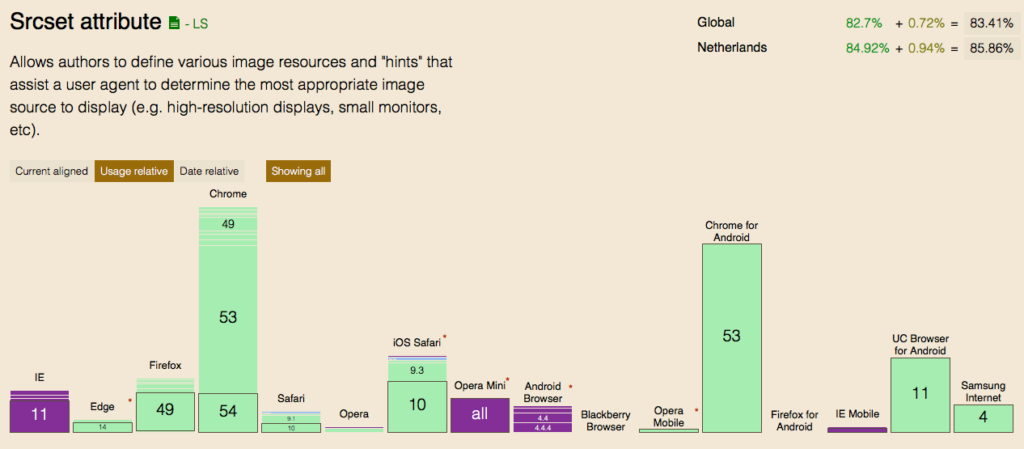
4. Serve responsive images (not just “scaled down” desktop images)
Scaling an image down visually is not the same as serving an appropriately sized file. Responsive images use srcset/sizes and/or <picture> so the browser can choose an appropriate source based on viewport size and pixel density.
A simple srcset + sizes resolution-switching pattern looks like:

Key Points:
- Srcset gives the browser a set of candidate images, while sizes provides layout hints that help it make the right choice efficiently
- The HTML specification defines how srcset and sizes can be used for viewport-based selection.
5. Advanced option: container queries for component-driven responsiveness
Nowadays, many teams build websites from reusable components such as cards, nav modules, and product tiles. In those cases, viewport-based media queries are sometimes too blunt: your component might sit in a narrow sidebar on desktop or a wide container on tablet.
Container queries solve that by letting you style an element based on attributes of its container (especially size), rather than the global viewport.
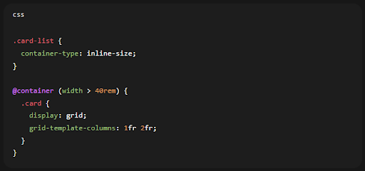
Browser support is now broad enough that container queries are viable for many modern sites (while still planning fallbacks for legacy browsers where needed).
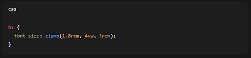
6. Advanced option: fluid typography with clamp()
Viewport units (vw) for responsive text sizing. A more controlled modern approach is to use clamp() so text scales smoothly but stays within sensible minimum and maximum values.
Learn the Practical Workflow for Responsive Website Design & Development
Plan with content first, not devices
Start by ensuring users can complete the main task on a small screen without friction. That means thinking about content priority, readability, and navigation before worrying about secondary details.
Choose breakpoints based on layout “breaks”
Breakpoints should be based on where the layout stops working properly, for example when a card grid starts to feel cramped, rather than being chosen only around popular device widths.
Build a flexible component system
Aim for components that can compress, reflow, or stack without breaking. Adobe, in particular, stresses the importance of building responsiveness into systems and processes at component level rather than treating it as a one-off page problem.
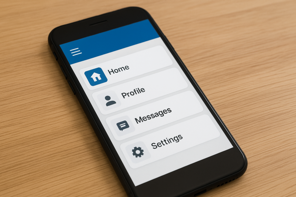
Optimise the “thumb zone” and tap targets
Mobile users interact via touch. Consider ease of use, spacing, and target size – especially for primary CTAs, navigation, and form controls. Adobe’s “think about thumbs” best practice maps well to formal accessibility guidance around target sizing.
Test early and test realistically
Testing is essential. We recommend beginning with emulators, and then validate what you find on real devices.
The Accessibility Essentials for Responsive Design
Responsive design and accessibility overlap heavily. Two high-impact checks:
Reflow (avoid two-directional scrolling)
Accessibility guidance on reflow says content should be viewable at narrow widths without losing information and without forcing people to scroll in two directions, except in cases where the content genuinely requires it. That fits directly with the core promise of responsive layouts.
Touch target size/spacing
WCAG guidance sets out minimum target sizes, or spacing alternatives, to make controls easier to tap without mistakes. That is particularly important for mobile menus, buttons, and icon-based controls.
How to Test Responsive Website Design & Development in 2026
Step #1: Start with viewport and layout sanity checks
Tools such as Lighthouse clearly flag pages that are missing a viewport meta tag. Without one, mobile devices tend to render pages at desktop widths and shrink them down, which harms readability straight away.
Step #2: Use Lighthouse for mobile usability and quality checks
Lighthouse is an open-source tool designed to improve web page quality through audits covering performance, accessibility, and SEO. It is also widely referenced as a strong option for assessing mobile usability now that Google’s old Mobile-Friendly Test has been retired.
Step #3: Test across layout contexts, not just screen sizes
Do not stop at testing “small”, “medium”, and “large”. You also need to check awkward scenarios such as:
- long headlines and long form labels (wrapping and overflow)
- large images and galleries (do they cause horizontal scroll or layout shift?)
- navigation patterns (does the menu remain discoverable on touch?)
When to Hire a Responsive Web Design Agency
If your website drives revenue, includes complex templates such as ecommerce, dashboards, or portals, or forms part of a redesign or migration, bringing in a responsive web design agency can save time and prevent expensive fixes later.
A good agency partner should be able to:
- Translate business goals into responsive UX priorities, including what needs to stay above the fold on small screens and what can be revealed progressively
- Demonstrate a component-based approach to responsiveness rather than relying on page-by-page overrides
- Provide a testing plan that covers performance and mobile usability using current tools
What to Include in Your Brief
Keep this short but specific:
- Key user journeys and conversion actions (enquiry, purchase, booking)
- Content types and templates (blog, landing pages, product pages)
- Analytics priorities (speed, conversions, engagement)
- Accessibility expectations (reflow, touch targets, keyboard navigation)
Ready to improve your responsive website design?
If you want expert help with responsive web development, performance, and accessibility—let’s talk today.
Most Frequently Asked Questions (FAQs)
Commonly cited core elements include media queries, flexible grid/layout techniques, and fluid images/media.
Responsive design adapts fluidly across screen sizes, while adaptive design is typically built around a set of fixed layouts for specific breakpoints.
Yes. Google retired the Mobile-Friendly Test tool and Mobile Usability report, but explicitly stated this does not mean mobile usability isn’t important; it remains critical and part of page experience guidance, and recommends modern tools like Lighthouse for evaluation.