Category: Web Performance & Development

  • Headless CMS Guide: Why Should You Switch Yours To One Now!

    Headless CMS Guide: Why Should You Switch Yours To One Now!

    A headless CMS is having a moment for a reason. Most teams are no longer publishing content to “just a website” — they’re feeding multiple sites, apps, landing pages, emails, digital screens, and new interfaces that keep popping up. Headless makes that easier because it treats content as something you store once and deliver anywhere.

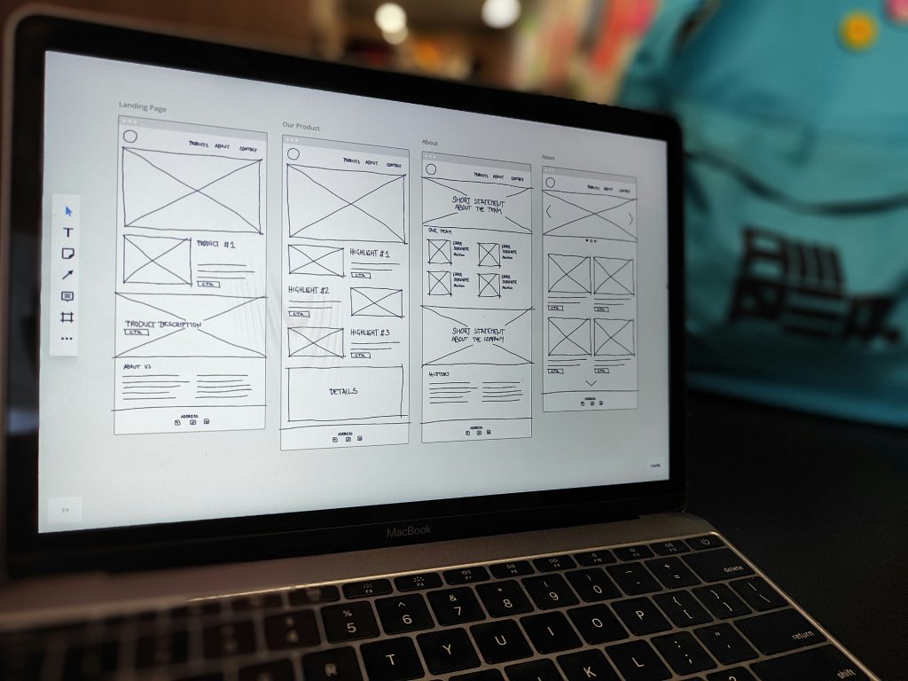
    If you’re feeling boxed in by templates, slow releases, or content that has to be copied and pasted across channels, this guide is for you. We’ll cover what headless CMS is, why it’s different, and how to decide whether switching now actually makes sense.

    Thinking about going headless but not sure where to start?

    Request a headless CMS readiness review and we’ll help you map the right approach for your team

    What is a Headless CMS?

    Headless CMS comes down to one core idea: the “head” or how content looks on the frontend is separated from the backend where content is created, stored, and managed. Instead of the CMS also being responsible for presentation, content is delivered to whatever frontend you want via APIs. 

    In other words, a headless content management system is built to deliver content beyond a single website. Your team manages content centrally, and developers use APIs to pull that content into websites, apps, and other channels. 

    How a Headless Content Management System Works in Practice

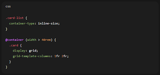
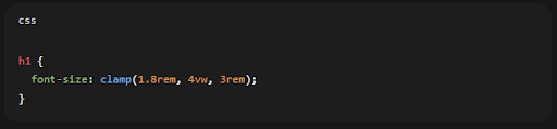
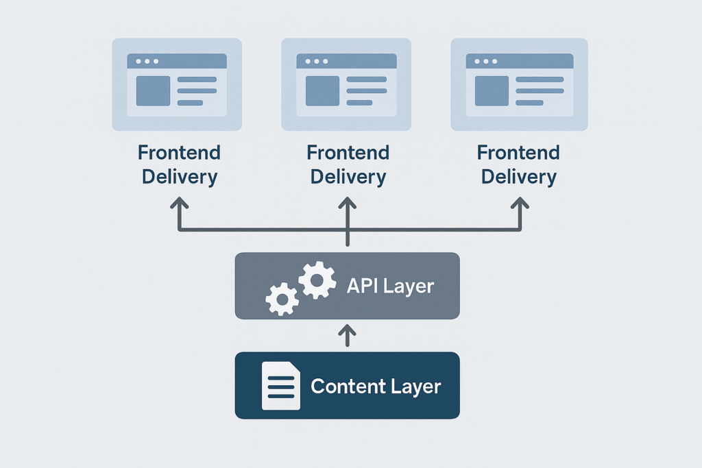
    Let’s break headless into layers, and it’s a helpful way to picture it. You have the content layer (where editors create structured content), the API layer (how systems fetch that content), and the presentation layer (the website/app/interface that displays it).

    That structure is what gives Headless its flexibility. Your CMS doesn’t dictate what the frontend must be – developers can choose what makes sense for performance, design, and product needs, while editors still get a dedicated authoring environment.

    Why Using a Headless CMS is Worth Considering Now

    Headless CMS often comes down to speed and reuse. When content is structured and centralised, you can update copy or assets once and push the change everywhere that content appears, instead of duplicating work across pages and platforms. Teams scaling across platforms also use an email verification API to keep contact data accurate. 

    This is where the COPE idea (or the “Create Once, Publish Everywhere”) gets brought up a lot. The principle is essentially structured content: create and manage content in one place so it can be reused across different outputs. 

    It also reduces bottlenecks. Headless frameworks are designed so that content and development teams can work in parallel, rather than constantly waiting for content changes to be processed in a developer queue. 

    Security and scalability get mentioned for a reason too. With headless, the CMS is separated from the public-facing presentation layer, which can reduce the attack surface compared with tightly coupled setups. 

    The Difference Between Headless, Traditional, and Decoupled

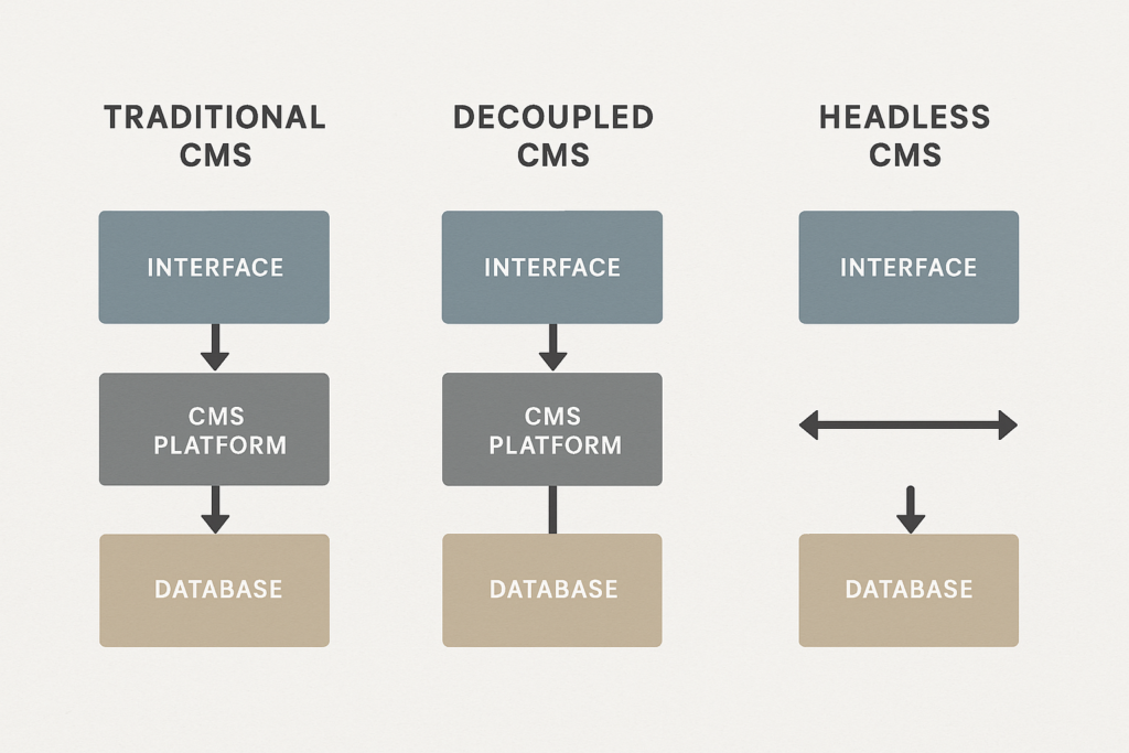
    Traditional CMS platforms were built to store and present content for websites, often with themes and templates controlling frontend output. That’s simple and fast for many sites, but it can make reuse across multiple channels harder, because content and presentation are closely tied together. 

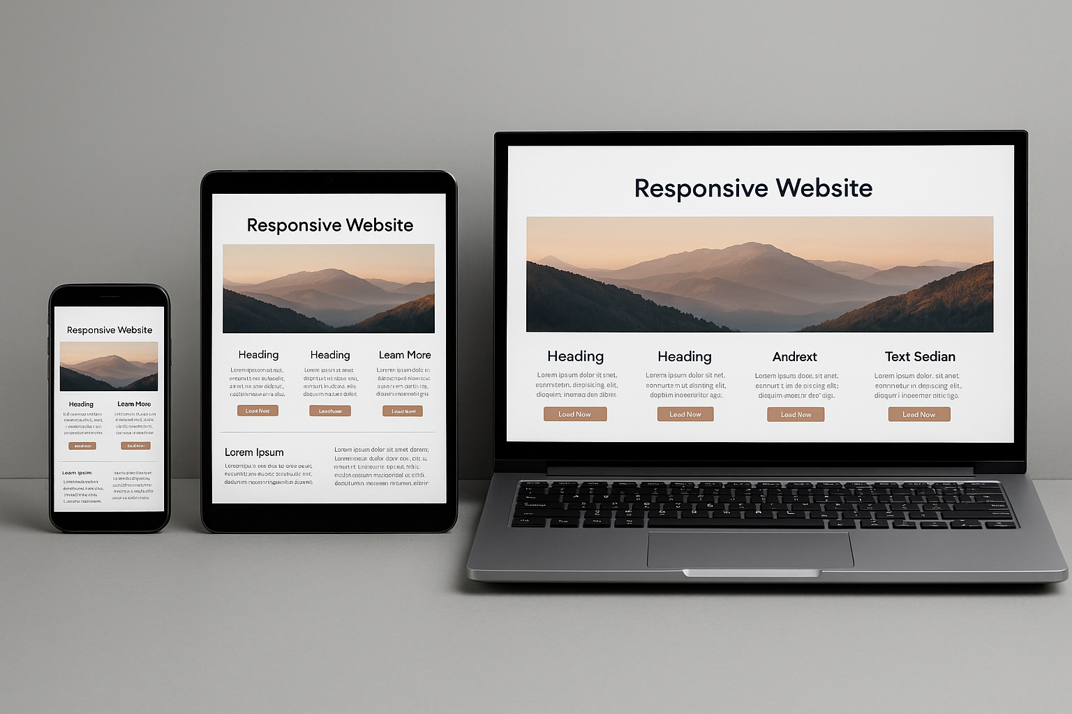
    Headless flips that. Once content is created, it’s delivered to the frontend via APIs, so you can publish to many channels and redesign the frontend without rebuilding your content operation from scratch. 

    You’ll also run into “decoupled CMS”. The simplest way to remember it is: decoupled systems separate the backend and frontend, but they may still include an optional “head” or default presentation layer; headless systems do not include a presentation layer at all. 

    Which Headless CMS Should You Choose?

    Which headless CMS is “best” depends on what you need to ship, and how your team works. A good way to decide is to start with the content and workflows you need, then shortlist platforms that can support those without locking you into awkward workarounds. 

    When you’re comparing options, ask questions like: 

    • Can you model the content structures you actually need?
    • Are hosting and maintenance handled?
    • Is it privacy-compliant?
    • Does real-time collaboration matter for your workflow? 
    • Are you locked into HTML for rich text, how do assets work?
    • Can you scale without surprising pricing jumps?

    If you’re building a shortlist, it’s also worth knowing you’re not limited to three “famous” platforms. You may check out headlessCMS.org for a broader list of headless content management systems, which can be a useful starting point for research. 

    Do You Really Need to Switch to Headless CMS Right Now?

    Headless is not automatically the right answer for every website. Even headless CMS educators point out that you generally need some technical resource available, because you’re effectively taking responsibility for how content is rendered and delivered on the frontend. 

    A sensible “switch now” trigger is when your business is starting to feel constrained: you’re adding channels, launching new digital products, scaling localisation, or you’ve outgrown rigid page templates and release cycles. That’s exactly the type of modern, multi-channel pressure headless CMSs were designed to handle. 

    Learn How to Migrate to a Headless CMS Without Breaking Everything

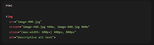
    A clean migration starts with content modelling. Before you move anything, define content types and reusable fields such as title, body, images, metadata, localisation, and components so your content can be recombined across channels, not just recreated in a new tool. 

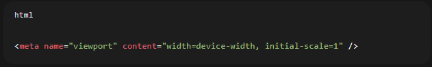
    From there, build your frontend delivery in a way that’s solid for search and performance. If your frontend is JavaScript-heavy, remember that search engines process JavaScript content through crawling, rendering, and indexing, and JavaScript issues can affect discoverability. 
    If you’re worried about SEO, don’t default to “dynamic rendering” as your primary plan. Google’s guidance describes it as a workaround and explicitly recommends server-side rendering, static rendering, or hydration instead.

    Here’s a Practical Launch Checklist You Can Use When Switching to Headless CMS

    Make sure you have:

    • Structured content models.
    • Preview and publishing workflows.
    • Redirects and URL mapping if you’re moving pages.
    • Metadata and schema support in your frontend templates.
    • A rendering approach that’s dependable for crawlers.

    Ready to Move from “Headless Curiosity” to a Real Plan?

    Let’s scope your migration, front-end build, and SEO requirements so you can switch with confidence.

  • A Complete Guide to Responsive Website Design & Development

    A Complete Guide to Responsive Website Design & Development

    Responsive website design is no longer optional. It’s the baseline expectation for websites that need to work across phones, tablets, laptops, desktops, and whatever screen size comes next. The goal is simple, to make the content easy to read, navigate, and use – without pinching, zooming, or horizontal scrolling.

    That matters because mobile use is substantial and persistent. Different data sources vary month to month, but global reporting shows mobile phones account for close to 60% of the world’s web traffic, and analytics datasets regularly show mobile at more than half of worldwide usage.

    Need help making your site truly responsive?

    Get a responsive audit and a prioritised fix list from our specialist team.

    In this guide, we’ll explain what responsive website design and web development are, the core techniques to implement both, how to test properly (using current tools), and when it makes sense to work with a responsive web design agency like us – Seek Marketing Partners.

    What is Responsive Website Design?

    Responsive website design is an approach to building pages that automatically adapt their layout and presentation to different screen sizes and contexts. In practical terms, that means content can reflow into one column on small screens, expand into two columns on medium screens, and use three or more columns on larger displays – without requiring separate mobile URLs or separate websites.

    The concept was originally defined by Ethan Marcotte (in an article published by A List Apart). His idea brought together flexible grids, flexible images, and media queries into one clear approach for designing around the natural flexibility of the web.

    What is Responsive Web Development?

    If responsive design is the plan – the layout choices, component behaviour, and content priorities – responsive web development is the build. It is the engineering work that makes those decisions real in code and keeps them robust over time.

    Responsive web development typically includes: 

    • Implementing fluid layouts and component rules so the design actually adapts.
    • Setting up responsive media handling so that images and video do not break layouts or slow pages.
    • Adding media queries (and, increasingly, container queries) to change styles based on layout needs 
    • Verifying accessibility requirements like reflow and touch target sizing 
    • Performance testing and iteration – because responsive that is done poorly can still be slow or frustrating on mobile networks.

    This is why the best outcomes happen when design and development work together, not in silos.

    Why Responsive Design is Recommended for SEO and Maintainability

    Responsive design usually means one URL and one set of content that can be displayed differently depending on screen size. That approach is explicitly recommended as the easiest design pattern to implement and maintain, and it helps avoid the complexity of dynamic serving or separate mobile URLs.

    It’s also important to note that some older “mobile testing” workflows have changed. Google retired the Mobile-Friendly Test tool and the Search Console Mobile Usability report on December 1, 2023 – while still emphasising that mobile usability remains critical and part of page experience guidance.

    The Core Building Blocks of Responsive Website Design

    Most web designers and developers agree on the fundamentals: viewport configuration, flexible layouts, responsive images, and media queries. The real difference between an “okay” site and a great one often comes down to how thoughtfully you apply these fundamentals to your actual content and components.

    1. Set up the viewport correctly

    A responsive site usually includes a viewport meta tag so mobile browsers size the viewport to the device width and don’t render at desktop widths and shrink everything down.

    It matters because without it, mobile devices typically render pages at desktop widths and scale down, which makes text harder to read and touch targets harder to use.

    2. Use flexible layouts instead of fixed widths

    Responsive layouts avoid locking key elements to pixel-perfect widths that can break on smaller screens. A common pattern is to use relative units such as percentages, rem, or vw, and let content respond to available space, rather than forcing fixed dimensions.

    A practical baseline for images, even before advanced responsive image techniques, is:

    3. Use media queries for layout changes

    Media queries let you apply different CSS rules depending on device characteristics. Most often, that means viewport width, but it can also include things like orientation or user preferences.

    Modern media query syntax is actively standardised in Media Queries Level 4, which defines how authors test for device features and apply conditional styling.

    4. Serve responsive images (not just “scaled down” desktop images)

    Scaling an image down visually is not the same as serving an appropriately sized file. Responsive images use srcset/sizes and/or <picture> so the browser can choose an appropriate source based on viewport size and pixel density.

    A simple srcset + sizes resolution-switching pattern looks like:

    Key Points: 

    • Srcset gives the browser a set of candidate images, while sizes provides layout hints that help it make the right choice efficiently
    • The HTML specification defines how srcset and sizes can be used for viewport-based selection.

    5. Advanced option: container queries for component-driven responsiveness

    Nowadays, many teams build websites from reusable components such as cards, nav modules, and product tiles. In those cases, viewport-based media queries are sometimes too blunt: your component might sit in a narrow sidebar on desktop or a wide container on tablet.

    Container queries solve that by letting you style an element based on attributes of its container (especially size), rather than the global viewport.

    Browser support is now broad enough that container queries are viable for many modern sites (while still planning fallbacks for legacy browsers where needed).

    6. Advanced option: fluid typography with clamp()

    Viewport units (vw) for responsive text sizing. A more controlled modern approach is to use clamp() so text scales smoothly but stays within sensible minimum and maximum values.

    Learn the Practical Workflow for Responsive Website Design & Development

    Plan with content first, not devices

    Start by ensuring users can complete the main task on a small screen without friction. That means thinking about content priority, readability, and navigation before worrying about secondary details.

    Choose breakpoints based on layout “breaks”

    Breakpoints should be based on where the layout stops working properly, for example when a card grid starts to feel cramped, rather than being chosen only around popular device widths.

    Build a flexible component system

    Aim for components that can compress, reflow, or stack without breaking. Adobe, in particular, stresses the importance of building responsiveness into systems and processes at component level rather than treating it as a one-off page problem.

    Optimise the “thumb zone” and tap targets

    Mobile users interact via touch. Consider ease of use, spacing, and target size – especially for primary CTAs, navigation, and form controls. Adobe’s “think about thumbs” best practice maps well to formal accessibility guidance around target sizing.

    Test early and test realistically

    Testing is essential. We recommend beginning with emulators, and then validate what you find on real devices.

    The Accessibility Essentials for Responsive Design

    Responsive design and accessibility overlap heavily. Two high-impact checks:

    Reflow (avoid two-directional scrolling)

    Accessibility guidance on reflow says content should be viewable at narrow widths without losing information and without forcing people to scroll in two directions, except in cases where the content genuinely requires it. That fits directly with the core promise of responsive layouts.

    Touch target size/spacing

    WCAG guidance sets out minimum target sizes, or spacing alternatives, to make controls easier to tap without mistakes. That is particularly important for mobile menus, buttons, and icon-based controls.

    How to Test Responsive Website Design & Development in 2026

    Step #1: Start with viewport and layout sanity checks

    Tools such as Lighthouse clearly flag pages that are missing a viewport meta tag. Without one, mobile devices tend to render pages at desktop widths and shrink them down, which harms readability straight away.

    Step #2: Use Lighthouse for mobile usability and quality checks

    Lighthouse is an open-source tool designed to improve web page quality through audits covering performance, accessibility, and SEO. It is also widely referenced as a strong option for assessing mobile usability now that Google’s old Mobile-Friendly Test has been retired.

    Step #3: Test across layout contexts, not just screen sizes

    Do not stop at testing “small”, “medium”, and “large”. You also need to check awkward scenarios such as:

    • long headlines and long form labels (wrapping and overflow)
    • large images and galleries (do they cause horizontal scroll or layout shift?)
    • navigation patterns (does the menu remain discoverable on touch?)

    When to Hire a Responsive Web Design Agency

    If your website drives revenue, includes complex templates such as ecommerce, dashboards, or portals, or forms part of a redesign or migration, bringing in a responsive web design agency can save time and prevent expensive fixes later.

    A good agency partner should be able to: 

    • Translate business goals into responsive UX priorities, including what needs to stay above the fold on small screens and what can be revealed progressively
    • Demonstrate a component-based approach to responsiveness rather than relying on page-by-page overrides
    • Provide a testing plan that covers performance and mobile usability using current tools

    What to Include in Your Brief

    Keep this short but specific: 

    • Key user journeys and conversion actions (enquiry, purchase, booking)
    • Content types and templates (blog, landing pages, product pages)
    • Analytics priorities (speed, conversions, engagement)
    • Accessibility expectations (reflow, touch targets, keyboard navigation)

    Ready to improve your responsive website design?

    If you want expert help with responsive web development, performance, and accessibility—let’s talk today.

    Most Frequently Asked Questions (FAQs)

    Commonly cited core elements include media queries, flexible grid/layout techniques, and fluid images/media.

    Responsive design adapts fluidly across screen sizes, while adaptive design is typically built around a set of fixed layouts for specific breakpoints.

    Yes. Google retired the Mobile-Friendly Test tool and Mobile Usability report, but explicitly stated this does not mean mobile usability isn’t important; it remains critical and part of page experience guidance, and recommends modern tools like Lighthouse for evaluation.

  • Web Design vs Web Development: Crafting Digital Experiences

    Web Design vs Web Development: Crafting Digital Experiences

    Understanding the difference between web design and web development is important for businesses wanting to have a good website. Let’s look at these two connected fields and see how they work together to make great websites that help businesses do well online.

    Key Takeaways: Web Design vs Web Development

    • Web design focuses on visual appeal and user experience
    • Web development deals with technical implementation and functionality
    • Designers create layouts, choose colors and typography
    • Developers handle coding and backend functionality
    • Both roles are essential for creating successful websites
    • Collaboration between designers and developers is crucial
    • Design emphasizes aesthetics, development emphasizes performance
    • Designers use tools like Photoshop, developers use programming languages
    • Both fields require creativity and problem-solving skills
    • Continuous learning is important in both design and development

    Web Design: The Visual and User Experience Architect

    Web design is about creating how a website looks and feels. It’s the art of making websites that look good and are easy to use. Web design services are important for businesses that want to make a good first impression and keep people interested in their site.

    Web designers are responsible for:

    • Creating layouts and wireframes
    • Choosing color schemes and typography
    • Designing user interfaces (UI) and user experiences (UX)
    • Ensuring responsive design for various devices
    • Crafting visual elements such as icons, buttons, and images
    • Implementing design principles like balance, contrast, and hierarchy

    To be good at web design, people need skills in graphic design software like Adobe Creative Suite, and knowledge of design principles and how people think. They often use tools like Sketch, Figma, or Adobe XD to create mockups and prototypes. Web designers also need to keep up with the latest design trends to create modern, engaging websites.

    Web Development: The Technical Implementation Specialist

    While web design focuses on how things look, web development brings those designs to life through coding and programming. Web developers make sure everything works smoothly behind the scenes. They turn static designs into interactive, dynamic websites that provide value to users and businesses.

    Web developers typically specialize in:

    • Front-end development (HTML, CSS, JavaScript)
    • Back-end development (server-side languages like PHP, Python, or Ruby)
    • Full-stack development (combining front-end and back-end skills)
    • Database management and optimization
    • API development and integration
    • Website performance optimization and security implementation

    Web developers use many tools and technologies, including integrated development environments (IDEs), version control systems like Git, and content management systems (CMS) such as WordPress. They’re also good at managing databases and connecting different systems. Web developers need to keep learning because new tools and best practices come out all the time.

    To keep up with evolving user expectations, leveraging UX talent on demand helps teams quickly access specialized expertise and improve overall user experience without long-term hiring commitments.

    Comparing Web Design and Web Development

    While web design and web development are different jobs, they both aim to create effective websites. Let’s compare these roles to better understand how they work together in making websites:

    Web Design vs Web Development Comparison

    Web Design vs. Web Development graphic

    As you can see, web designers are better at visual and creative things, while web developers are better at technical stuff. In many cases, a UX design agency brings both skill sets together, ensuring that usability, aesthetics, and technical performance align seamlessly. But sometimes these jobs overlap, especially in smaller teams. This overlap can make work go smoother and lead to better website solutions.

    The Synergy Between Web Design and Development

    The best results happen when web designers and developers work well together. This teamwork makes sure websites look great and work perfectly. Good web design and SEO go together, creating websites that attract and keep visitors while also showing up well in search results.

    Good teamwork between designers and developers involves:

    • Clear communication about design ideas and technical limits
    • Regular meetings and feedback sessions
    • Using tools that help share designs and code
    • Understanding each other’s jobs and challenges
    • Working in steps to improve and optimize the website
    • Sharing responsibility for the final product’s success

    Career Paths and Job Market Outlook

    Both web design and web development offer good job opportunities. The Bureau of Labor Statistics says jobs for web developers and digital designers are expected to grow 16% between 2022-2032, which is much faster than average. This growth is happening because businesses in all industries need a strong online presence.

    RoleMedian Annual SalaryJob Growth (2022–2032)Education Required
    Web Designer$55,00016%Associate’s or Bachelor’s Degree
    Web Developer$80,73016%Associate’s or Bachelor’s Degree
    UX Designer$75,00016%Bachelor’s Degree
    Full-Stack Developer$90,00016%Bachelor’s Degree

    Whether you like the creative parts of web design or the technical challenges of web development, there’s a place for you in this growing field. Many people find that learning skills in both areas can lead to more job opportunities and a better understanding of how to make websites.

    The Impact of Web Design and Development on Business Success

    A well-designed and properly developed website can really help a business succeed. Here are some interesting facts:

    • 38% of visitors will stop using a website if it looks unattractive
    • 48% say the design of the website is the most important factor in deciding if a business is trustworthy
    • 98% of people who’ve had a bad website experience will go to a competitor instead
    • 75% of consumers judge a company’s credibility based on their website design
    • 94% of first impressions are related to design

    These facts show how important both web design and development are in creating successful online experiences for businesses. A website that looks great but works poorly, or one that works well but looks bad, will have trouble turning visitors into customers. The combination of good design and solid development is key to online success.

    Seek Marketing Partners’ Approach to Web Design and Development

    At Seek Marketing Partners, we know how important it is to combine web design and development to create powerful online presences for our clients. Our team of skilled professionals works together to deliver websites that not only look great but also work exceptionally well on all devices and platforms.

    We offer complete web design services and web development services for businesses of all sizes. Our approach combines creativity with technical know-how to deliver results that help our clients grow and succeed. We focus on:

    • User-centered design principles
    • Responsive and mobile-first development
    • Search engine optimization (SEO) best practices
    • Performance optimization for fast loading times
    • Accessibility compliance
    • Scalable and maintainable code structures

    Conclusion: The Future of Web Design and Development

    As technology keeps changing, web design and development will change too. New trends like artificial intelligence, virtual reality, and progressive web apps are shaping the future of the web. However, the basic principles of creating visually appealing, user-friendly, and technically sound websites will still be important.

    The future of web design and development is likely to see:

    • More use of AI in both design processes and user interactions
    • Greater focus on accessibility and inclusive design
    • More immersive web experiences through AR and VR technologies
    • Continued focus on performance and speed optimization
    • Integration of voice user interfaces and natural language processing

    Whether you’re a business owner looking to improve your online presence or someone who wants to work in this field, understanding how web design and development work together is key to success in the digital world. At Seek Marketing Partners, we’re committed to staying up-to-date with these changes, ensuring our clients always have access to the latest web solutions.Ready to make your online presence better? Contact Seek Marketing Partners today to learn how our expert web design and development services can help your business do well online. Let us create a website that not only looks great but also delivers real results for your business.

  • Web Design Bury & The North West Can Count On!

    Web Design Bury & The North West Can Count On!

    Your business website is one of the most important marketing tools you have at your disposal. It is the first port of call for potential customers, and it needs to be as slick and modern as possible if you want to stand out from your competitors. It’s not just about aesthetics though – a good website is also essential in helping you achieve your digital marketing goals.

    If you’re looking for someone to help design and develop a website for your Bury business, then look no further than the Seek Marketing Partners team. We’re Bury’s only full service digital marketing agency, and we’ve been providing businesses in town and further afield with top quality digital marketing support since 2015.

    We know from experience that in modern business, sleek design is important – but so is functionality, reliability and ease of use. Our web design and development team is made up of highly-skilled professionals who will work with you every step of the way to ensure that everything they do meets your expectations.

    The Extra Support Provided By Our Comprehensive Service

    Installation & Setup

    At this point, the Seek Marketing Partners team will migrate the latest and greatest piece of web design Bury has seen from our private staging servers to your hosting server. We’ll do all of the setup work that needs to be done, and will set your new site live.

    We Do Web Design Bury Can Trust, And We Do Hosting Too

    Of course, before it can begin to contribute to your digital marketing strategy or meet the information needs of your customers, your site will need somewhere to reside on the world wide web. The Seek Marketing Partners hosting server is the perfect place for your Seek Marketing Partners designed site to reside… You get a one-stop-shop solution covering all the bases, and if you want any changes making, or new features adding, the Seek Marketing Partners team already have all the access we need to take care of it!

    Maintenance

    The support offered by the Seek Marketing Partners team goes beyond quality web design Bury can trust… As a result it doesn’t stop once the site goes live, and starts doing its job assisting your digital marketing efforts. It’s a simple fact of web design that sometimes things go wrong, and sites break or go down. Fear not though, as should this happen to your site, Seek Marketing Partners will still be on hand to fix it, as well as carrying out regular routine maintenance to improve your site and keep it in good working order.

    Our Tried & Tested Web Design Process

    The Four Tenets of Web Design

    Seek Marketing Partners follow four main tenets of Web Design, which guide the order in which we do things. Those tenets are ‘Strategy, Design, Develop, Deploy’, and they have helped us develop the following step-by-step process:

    Step 1: Usability & Competition Analysis

    The first thing Seek Marketing Partners will do when you come to us is to go look at your competition. We do this to figure out what your new site – built by the team behind the best web design in the UK – will need to do in order to beat your competition, and how it will need to do it. Checking out the competition can also give the Seek Marketing Partners team some inspiration, and suggest new ideas that maybe you or we hadn’t thought of… Ideas that we can then carry forward and implement on your site…

    Step 2: Information Architecture Design & Website Content Strategy

    Once the Seek Marketing Partners team know who and what we’re up against, we’ll start planning out your site. At this point Seek Marketing Partners will draft the basic layout of your site… The pages that will be needed, the content that will go on those pages, and which pages will link to each other within your site. It’s important to do this now because in order to create a great end product that both we and you can be proud of, our team need to know what content will be needed. On top of this, knowing what content will need to be created ahead of time can ease the SEO process and help inform your social media marketing strategy, as well as other areas of digital marketing.

    Step 3: Responsive Website Design

    This is where the Seek Marketing Partners web design team – the team behind some of the best web design in the UK, don’t forget – do their thing, and make all the prep work come together by actually building your site. As always, implementation is carried out in accordance with your original brief and any feedback you send our way during the design process, while also bearing in mind the features and functionality that your Seek Marketing Partners website will need to have in order to meet the digital marketing goals defined in previous steps.

    Step 4: User Experience Design

    Seek Marketing Partners know that the experience your site delivers to the people that visit it matters. Google knows this too, and user experience does play a part in determining your site’s SEO score and Google rank these days. As part of our comprehensive web design services Seek Marketing Partners will bake everything you need to provide a great user experience into your site… Thereby also helping your SEO and your wider digital marketing strategy too.

    Step 5: CMS & e-Commerce Integration

    The next step for our development team is to integrate your CMS and any e-Commerce solutions or functionality that you want added into your site. Adding these features can really help your website pull its weight with regards to your overall digital marketing effort… Making your site not only a repository for information, but a place where you can close sales of your goods and services too!

    Step 6: Cross-Browser Testing

    Once everything is built, the Seek Marketing Partners team will get to work making sure that your website runs smoothly, and delivers that top-notch user experience on all of the various different browsers and platforms that might be used to view it – including devices such as mobile phones and tablets. Once all of the kinks are worked out, it’s time for the site to go live, and start contributing to your digital marketing strategy.

    Step 7: Advanced Features

    Seek Marketing Partners usually work with the WordPress platform – we think it’s a great all-rounder that can create great websites for almost any purpose. However, our team aren’t blinded by this or beholden to it, and we have no problem designing and developing advanced or custom features from scratch that will take your site and its functionality above and beyond the competition.

    At this point, the Seek Marketing Partners team will migrate the latest and greatest piece of web design Bury has seen from our private staging servers to your hosting server. We’ll do all of the setup work that needs to be done, and will set your new site live.

    Our Other Digital Marketing Services

    This isn’t all though – Seek Marketing Partners is a full-service digital marketing agency, meaning that we offer a raft of other services alongside the web design and development that we’ve spoken about already. These services include SEO, PPC and email marketing campaign support, graphic design, branding support and content writing, social media support, data science and more.