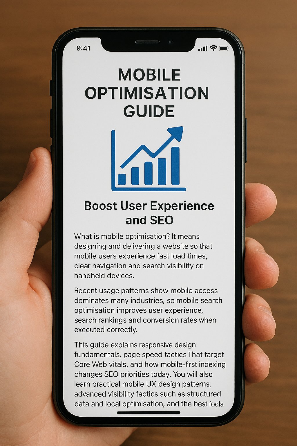
What is mobile optimisation? It means designing and delivering a website so that mobile users experience fast load times, clear navigation and search visibility on handheld devices. Recent usage patterns show mobile access dominates many industries, so mobile search optimisation improves user experience, search rankings and conversion rates when executed correctly.
This guide explains responsive design fundamentals, page speed tactics that target Core Web Vitals, and how mobile-first indexing changes SEO priorities today. You will also learn practical mobile UX design patterns, advanced visibility tactics such as structured data and local optimisation, and the best tools and KPIs for ongoing monitoring.
The Importance of Responsive Website Design for Mobile Optimisation
Responsive website design is an approach where layouts adapt fluidly across screen sizes using fluid grids, flexible images and CSS media queries. The mechanism uses proportional column systems and responsive images to ensure content parity while preserving visual stability and speed; the result is consistent UX and better crawlability on mobile-first search engines.
Responsive design reduces duplicate content risk by using the same HTML and CSS across devices while adapting presentation, which supports mobile-first indexing and simplifies maintenance. Developers should treat responsive design as the foundation of mobile optimisation and validate implementations with viewport meta settings and responsive image attributes.
How Fluid Grids and Flexible Images Enhance Mobile Responsiveness
Fluid grids allow layout units to scale relative to viewport width, so elements reflow naturally between breakpoints without fixed pixel values. This mechanism reduces layout shifts and avoids overflow on small screens, directly improving visual stability and perceived speed for mobile users.
For images, using responsive images (<img srcset> and <picture>) combined with modern formats like WebP or AVIF lets the browser choose the best file for the device, reducing bytes transferred and improving LCP.
Implementing responsive images and fluid grids together preserves design intent while cutting load time and preventing layout thrashing during rendering.
Media Queries Play a Role in Creating Adaptive Mobile Layouts
Media queries drive conditional styling so layouts and typography change based on viewport characteristics rather than assumed device models. The recommended approach is content-driven breakpoints – define breakpoints where the layout needs to change, not by device names – because this ensures consistent behaviour across new screen sizes.
Use concise media query rules for typography scaling, grid reflow and visibility toggles, and avoid overly specific device targeting that becomes brittle as hardware evolves. Thoughtful media queries combined with progressive enhancement ensure accessibility and resilient mobile layouts.
How to Improve Mobile Page Speed to Boost UX and SEO
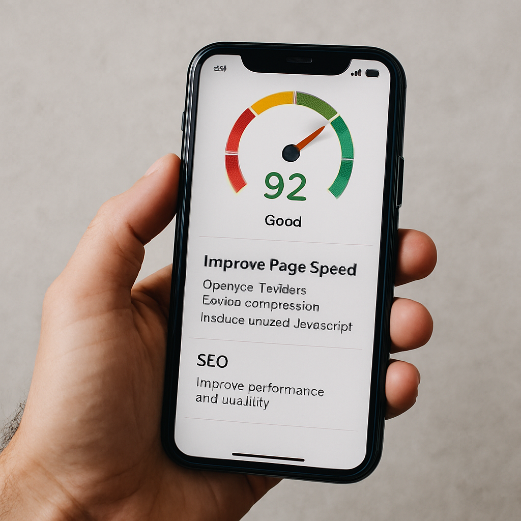
Improving mobile page speed means prioritising assets and reducing critical rendering time so Core Web Vitals meet thresholds on handheld networks. The mechanism focuses on shrinking payloads, reducing render-blocking resources and optimising critical requests so browsers can paint the Largest Contentful Paint quickly and keep interactions smooth.
Faster pages increase engagement and support better organic visibility because search engines factor mobile performance into ranking signals. Teams should prioritise fixes by impact and effort, starting with images, caching and third-party script management.
Common Mobile Optimisation Techniques
| Technique | What It Affects | Typical Improvement |
| Image compression & WebP/AVIF | LCP and overall bytes | 20-50% smaller images; reduced LCP by 0.3–1.0s |
| Lazy loading non-critical assets | Initial load and bandwidth | Reduces initial payload; lowers Time to Interactive |
| CDN usage | Time-to-first-byte (TTFB) | 20-60% reduction in geographic latency |
| Browser caching & preconnect | Repeat visits and connection cost | Faster repeat loads; fewer round trips |
This comparison helps prioritise where to invest effort: image optimisation and CDNs often yield the largest mobile improvements per hour of work, while script deferral and caching compound gains.
Begin by auditing and compressing images using responsive formats and delivering appropriate sizes via srcset. Implement caching, preconnect and use a CDN to reduce TTFB and regional latency. Eliminate or defer render-blocking JavaScript and inline critical CSS to speed initial paint. Prioritising in this order quickly improves Core Web Vitals and mobile user experience.
Core Web Vitals: How They Impact Mobile Page Speed
Core Web Vitals measure user-centric performance: Largest Contentful Paint (LCP) assesses loading, Interaction to Next Paint (INP) measures responsiveness, and Cumulative Layout Shift (CLS) tracks visual stability.
On mobile, LCP should occur within roughly 2.5 seconds, INP should be low and responsive, and CLS should be minimal to avoid disruptive shifts during interaction. These metrics map to concrete causes – oversized images and slow servers for LCP, long-running main-thread tasks for INP, and non-dimensioned images or ads for CLS – and each has targeted remediations.
Improving Core Web Vitals directly boosts mobile UX and reduces abandonment, which in turn supports improved mobile search visibility.
Techniques Like Image Compression and Lazy Loading Optimise Mobile Performance
Image compression, modern formats and lazy loading cut the bytes required for initial render, while preloading critical assets ensures priority delivery for above-the-fold content.
Implement responsive images (<img srcset>), serve WebP or AVIF where supported, and lazy-load below-the-fold media to defer non-critical downloads. Use <link rel=”preload”> for hero images and critical fonts, minify CSS/JS and implement HTTP caching with sensible max-age for static assets.
A CDN reduces geographic latency, and combined with resource hinting (preconnect, dns-prefetch), reduces round-trip costs, producing measurable reductions in LCP and improved perceived speed.
Mobile-First Indexing: How It Affects Your SEO Strategy
Mobile-first indexing means search engines primarily use the mobile version of a page for indexing and ranking, so the mobile experience directly determines search visibility.
The mechanism shifts SEO priorities: content parity between mobile and desktop must be maintained, structured data should be present on the mobile pages, and metadata must be identical to avoid ranking discrepancies. For SEO strategy, this requires auditing the mobile site for missing content, lazy-loaded elements that are inaccessible to crawlers, and any differences in internal linking.
Ensuring the mobile view contains the full informational content preserves ranking signals and prevents visibility regressions.
| Attribute | Mobile Version | Desktop Version | Recommended Action |
| Visible content | Must match | Often matches | Ensure full content parity on mobile |
| Structured data | Add to mobile HTML | Often present | Mirror schema markup on mobile pages |
| Metadata (title/description) | Include identically | Include identically | Keep metadata consistent across versions |
| Internal links | Should be accessible | Typically accessible | Avoid hiding important links behind JS-only controls |
Begin by comparing rendered mobile and desktop HTML for content parity and schema presence. Ensure that critical content is not injected only via client-side JavaScript in a way that search crawlers cannot access.
Verify metadata and canonical tags are consistent and test with Search Console-style rendering tools. Following those steps aligns your SEO strategy to the mobile-first indexing model and prevents ranking loss.
Mobile Optimisation Best Practices
Mobile SEO Fundamentals
Mobile keyword research focuses on intent-driven queries and long-tail phrasing, especially those used in voice search. Use analytics and autofill suggestions to map queries to page intent, ensuring concise, scannable answers are visible near the top of pages.
Meta titles and descriptions should be front-loaded with the primary keyword and clear CTAs, optimised for truncation on mobile SERPs. Use schema where relevant to enhance visibility and support mobile search optimisation, and regularly test variations to improve click-through rates.
Mobile UX and Touch-Friendly Navigation
Design for mobile with touch-friendly controls, adequate spacing (approximately 48×48 CSS pixels), and visual feedback for interactions. Simplify navigation with top-level menus, prioritised tasks, and sticky CTAs, while limiting menu depth to reduce friction.
Optimise forms with autofill, appropriate input types, and reduced fields to make completion quick and easy. These practices enhance usability, reduce errors, and improve engagement on mobile devices.
Advanced Mobile Optimisation and Local Reach
Implement structured data such as FAQPage, HowTo, and LocalBusiness schemas to increase eligibility for rich results and PAA answers.
Optimise for local “near me” queries with consistent NAP data, mobile-friendly local landing pages, embedded maps, and prominent click-to-call actions. Combining these strategies improves mobile visibility, local search performance, and conversion rates for on-premise interactions.
Mobile Testing, Monitoring, and KPIs
Regularly audit mobile performance using PageSpeed Insights, Lighthouse, Google Search Console, and GA4 to track Core Web Vitals, mobile traffic, and conversions.
Schedule automated lab tests weekly and field monitoring monthly, with alerts for regressions. Establish dashboards that combine user metrics and search visibility signals to ensure ongoing mobile optimisation aligns with business goals.

Partnering with Specialists
For organisations ready to accelerate performance improvements, Seek Marketing Partners offers a mobile optimisation audit and consultation that applies a data-driven methodology and leverages their combined SEO and Web Design & Development expertise.
The audit delivers an actionable roadmap, prioritised by measurable impact, and the agency provides ongoing optimisation support with transparent progress updates and a dedicated account manager to coordinate technical work and reporting.